Redesigning Vanguard’s Year in Review
A Client Project for MEJO 581
Over the course of the fall 2025 semester at UNC-Chapel Hill, I enrolled in MEJO 581: User Experience Design and Usability. Our final project, following months of studying what makes for effective web design, was a client project for Vanguard. Vanguard is an investment company whose robo-advisor service guides users in understanding where and how to invest their finances. Students were tasked with redesigning Vanguard’s Year in Review, a year-end wrap-up summary of a user’s finances and investments over the previous year — for an audience of clients aged 50 and older.
The goal of the project was to streamline the information presented within the Year in Review, improve navigation, and enhance the overall usability and usefulness of the tool. I aimed to make the experience more personal, visual and actionable by adding specific insights and clearer visual storytelling to highlight each user’s progress toward their financial goals — features my research found particularly important for those nearing or entering retirement. The result is a year-end experience that feels genuinely helpful rather than overwhelming, giving users a clear understanding of their progress and more confidence about the road ahead.
Project Introduction & Overview

Research and Foundations
Usability Report and Testing
One of the first steps in the project was conducting a usability test and listening session with someone in the target age demographic. I worked with Alyson, a 50-year-old mother of two college-aged kids who manages her investments through personal research and occasional meetings with a workplace financial advisor. During the listening session, I learned about her financial goals, decision-making strategies, and beliefs about investment management. She also shared her perspective on the role technology should play in finance, the advice she’d give young adults starting out, and what helps her feel secure when managing financial information.
We then transitioned into a usability test of Vanguard’s existing site and Year in Review. Alyson completed tasks such as logging in, finding definitions for unfamiliar terms, linking new accounts, and interpreting unclear elements. Pre- and post-test questionnaires helped gauge her confidence and comfort level with the experience.
Key insights from the session showed that users 50+ prioritize clarity and ease of use, and many remain unsure about how much they can or should rely on technology for financial decisions. Alyson also felt several graphics and charts were too vague to be meaningful, so I flagged visual aids as a design priority. After sharing findings with my three teammates, we combined our results into a comprehensive analysis of what worked and what didn’t in the original Year in Review, giving us a strong foundation for the redesign.
View the group usability report below or by clicking here.
Audience Analysis
Our audience analysis helped us reflect on and clarify who the redesigned Year in Review needed to serve, as well as what expectations they would bring into the experience. We considered our usability testing and completed research on things like location, age range, gender, educational background, income status, financial stability and financial and technical literacy. We developed a clearer picture of the typical Vanguard client nearing retirement. Our target audience was men or women aged 50 and older who may or may not have a college degree but often have moderate to high incomes with a relatively stable financial portfolio. Our users have varied technical literacy and moderate to high financial literacy.
Based on this information, we surmised that many likely users feel confident managing their money yet still want reassurance, clear language, and straightforward navigation when interacting with digital tools. These insights reinforced the importance of a simple, trustworthy, and visually clear interface that respects users’ existing financial knowledge while still feeling intuitive. We decided the Year in Review should support a user’s existing knowledge through helpful tips and streamlined interactions that keep financial information at the heart of the tool. No matter what their income, users of this demographic seem likely to care most about clarity and long-term progress toward their goals, particularly retirement.

Persona Poster and Empathy Map
After creating a comprehensive overview of the target audience for this project, it was time to get more specific. We completed the rest of the project individually, so I decided on a hypothetical user for my redesign. My user, named Lee Anderson to avoid any bias that could come from a more inherently gendered name, has moderate experience in personal finance. They enjoy planning and regularly educate themselves on preparing for retirement, but they find themself easily overwhelmed by complicated technology. They hope to retire soon with enough money to travel, pay for their children’s education and leave a financial legacy. This persona emphasizes the skeptical yet curious and hopeful mindset that I noticed in my group’s research and from my usability testing.
For my persona poster, I kept identifying details vague to mitigate any potential bias, excluding details like gender and race. I focused on a minimal visual layout with a few pie charts and personality sliders to show important information at a glance. For the empathy map, I was especially influenced by the results of my usability test. I considered some of the things the participant reported feeling, incorporating them to create a comprehensive overview of both the frustrations and the relief that can come with having financial information on a consolidated online tool.
View my persona poster and empathy map below.


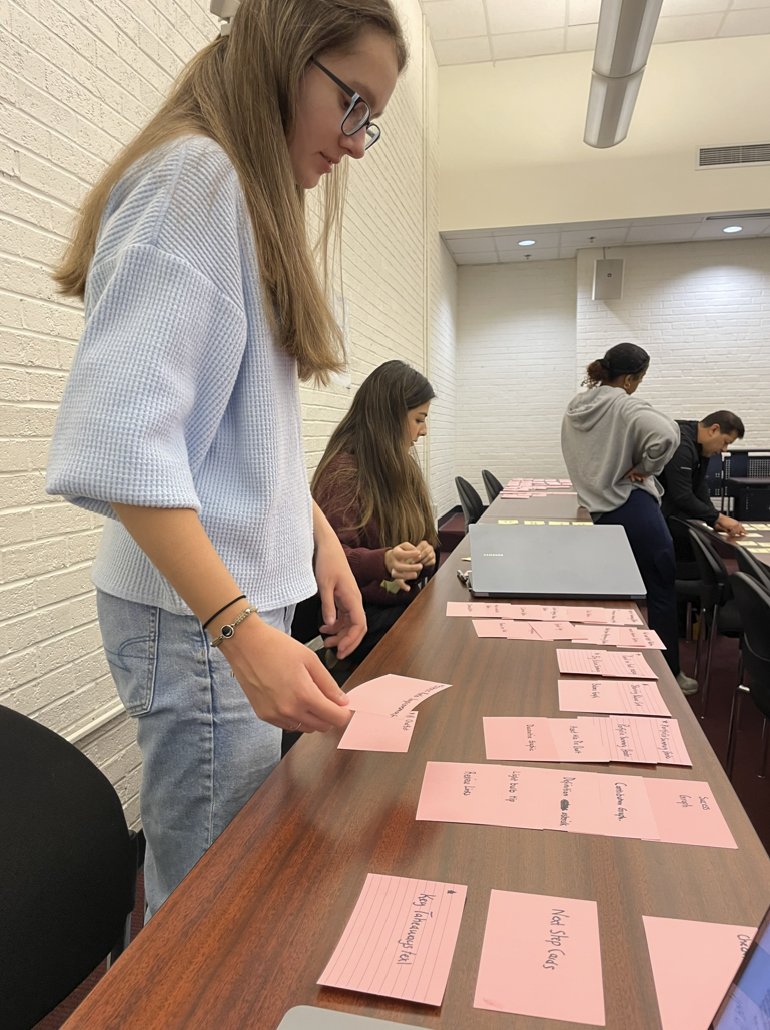
Card Sorting Activity
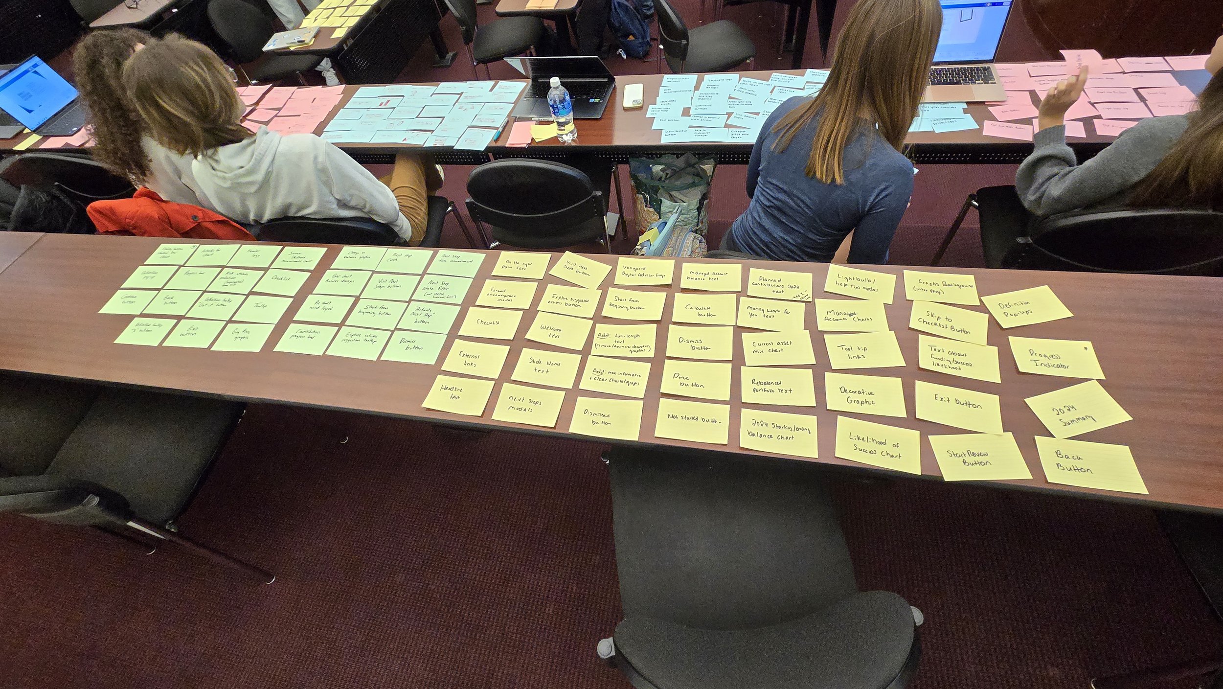
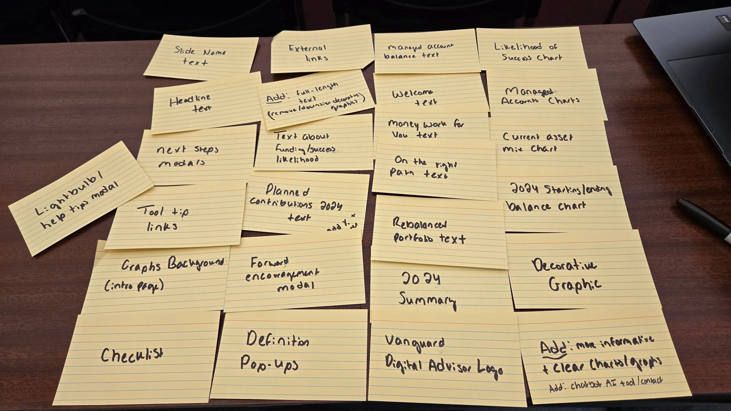
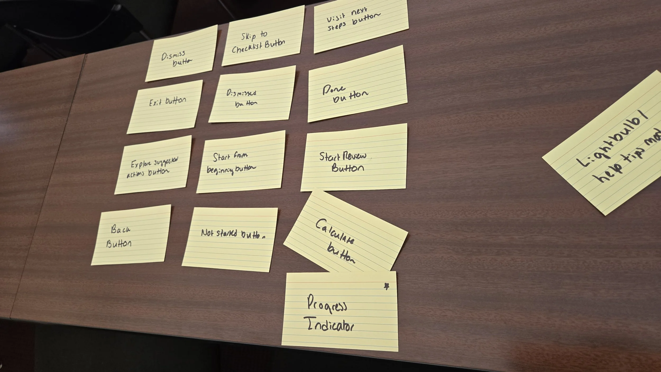
Now that it was clear who I would be designing for, it was time to start thinking about how I could create those designs. We kicked of the process in class by taking a few minutes to scan through the existing Year in Review and write each included asset type on a notecard. We then laid our cards on table and completed an open card sort where we sorted the notecards into groups based on whether they were functional or design elements. We then groups the cards into logical screen order, beginning to think about which assets would be necessary on which screens and creating the flows that would define our redesigns. My assets, included in the photos and chart below, served navigational, informational and visual purposes, each with their own place across various slides.


Design Work
User Flows
With assets determined and an inkling of how the redesigned Year in Review would function, I created a user flow diagram to visualize the primary order in which users would move through screens, as well as alternate paths made at various decision points. Because the Year in Review functions almost as a slideshow of sorts, my diagram was generally very linear. I attempted to preserve the core structure of Vanguard’s original Year in Review while creating a clearer, more intuitive narrative enhanced by added information and specific action steps.
Because retired or near-retired users value clarity and reassurance, my flow emphasizes long-term growth and logical ordering. The sequence begins with a welcome screen before moving into a brief year-end highlight section. Users move on to broader economic context that helps them understand their finances in the overall economic sphere of the year then land on a single section highlighting Vanguard’s value as a service.
The sequence moves from a simple introduction to broader economic context and then into the user’s personal progress, helping investors understand their outcomes within the larger market rather than feeling solely responsible for fluctuations of their investments. Several screens focus on various aspects of a user’s goal progress and contributions. I consolidated all Vanguard and robo-advisor content into a single, straightforward section to highlight the concrete value of the service, and I added an actionable summary to encourage continued engagement. Overall, the flow offers a supportive, predictable start-to-finish experience that aligns with how long-term investors prefer to view their financial information. This flow was helpful in planning out the designs I would soon begin creating in the form of wireframes.
View the flow diagram below or by clicking here.
User Flows
With all the research and initial design work done, it was finally time to begin creating. I slowly began shaping the look of the redesigned Year in Review, imagining where elements would go and considering the best ways to accomplish my goal of streamlining navigation. I used circles for icons and logos, large boxes for charts or decorative images, small boxes for buttons and placeholder text. The structure didn’t stay exactly the same when I created the high-fidelity mockups, but these wireframes provided a basic structure for which elements would be placed where. It was nice to see everything finally begin to come together as I combined all the ideas I’d been learning into a real product.
View the wireframes below or by clicking here.
I began to turn my flow into more tanglible ideas by completing sketches that visualized what the new Year in Review could look like. I first curated a collection of inspiration photos and designs from similar financial tools to gain a solid understanding of what users could be expecting from Vanguard. I pulled relevant images, logos and colors from Vanguar'd’s existing site to incorporate in my designs later on. Finally, I completed sketches for each page, thinking through asset placement and functionality.
View my inspiration and sketches below or by clicking here.
Inspiration and Sketches
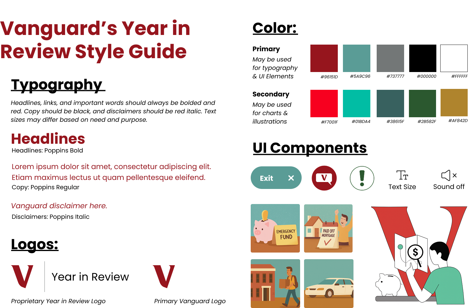
UI Kit and Style Guide
The last step before putting together the final prototype was determining what the designs would actually look like. I had the layout down, but layout means nothing without good style. I took a look at Vanguard’s existing website and Year in Review to find a set of fonts and colors that were appropriately branded and accessible. I decided to both utilize Vanguard’s typical logo and create a proprietary Year in Review logo to be placed in the top navigation bar, a decision made based on the fact that Vanguard does this on other website pages, such as their digital advisor dashboard page.
Colors in the guide are based on colors frequenly found within Vanguard’s current illustration style and branding. I created a new AI chat button — in my usability test, the participant said having a way to seek help for misunderstood items would be helpful — along with a standardized exit button, an alert icon, and accessibility icons to make the experience more eye-catching and streamlined. I noticed two separate styles of graphics within their existing tools, and decided to utilize both of these styles to remain cohesive with everything else. One style is illustrated and playful, while another is sharper and more linear. I decided I would use the more playful graphics for decorative images on goals pages and the sharper images for larger and more dominant images. I used AI tool Microsoft Copilot to generate these images for the purpose of the project, although if this were real I would want human designers to create more empathetic and emotional illustrations.
Wireframes
With design fundamentals complete, it was finally time to create a working prototype utilizing all I had learned and planned. I copied my wireframes into a new file and got to work adding colors and real text, making sure the actions and goals mentioned through the screens aligned with those of the user I created in the persona-building stage. I added visual variety, varied text sizes and weights, charts, graphs and images to bring together useful information and visual interest for an experience that feels authentic and personalized.
I paid careful attention to the language of the Review, making it neutral and supportive while encouraging the user to stay with Vanguard for another year, emphasizing progress and minimizing focus on failures through reassuring messages. I added pop-ups and visual tool tips designed to help users understand words they don’t know, along with a chat button on every page should something still be unclear. I aimed to make the user feel supported and interested throughout their experience. To make navigation simpler, I added a static navigation bar on the side listing each page’s title, with the idea that users can easily click both to previous and next pages and to other pages within the review as they please.
View the mockups below or by clicking here.
High-Fidelity Mockups
The last step in completing my design for this project was connecting everything together — I wanted to make something interactive and truly representative of what a new Year in Review could be, serving as an accurate depiction for the client. Using Figma’s prototyping functions, I made menus interactive and buttons clickable. I connected together pop-up screens and created component variations that could easily become clickable. It was challenging and tedious, but the overall result was an impressive one. It was amazing to see the designs I’d spent all semester working on finally come together into something polished and professional.
View the prototype below or by clicking here.
Working Prototypes
Because this was a project for a client, each student had the opportunity to present their work to Vanguard in place of a traditional exam. I believe the most valuable and innovative parts of my redesign are the inclusion of broader economic context and the more accessible and streamlined navigation, so these are what I chose to emphasize most heavily. I opted for minimal text on my slideshow so the client would focus on the words I said with support from the examples of each point.
I started by pointing out the busyness of Vanguard’s existing Year in Review and the lack of overall clarity, something that could hinder the effectiveness of the tool for anyone no matter their age demographic. I then moved into how these problems are compounded for older audiences nearing retirement who, as I learned through my usability test, are often easily overwhelmed by too many navigation options and prioritize long-term knowledge, financial independence and steady financial planning.
I then discussed how my redesign improves these problems, first by showing the economic context that helps users understand their finances in terms of the broader economic market, removing some blame from the user if their finances don’t go as planned that year and emphasizing the importance of using a tool like Vanguard that can manage investments in tumultuous economic times. Additionally, I showcased the improved navigation that makes the experience more intuitive for someone of the target demographic.
I ended the pitch with a closing statement connecting to Vanguard’s values of trust and innovation, asking them to consider taking the actions they so often ask of their clients.